


Every Extra Step in Your Checkout Is Costing You Orders

When I audit a client's website, I always walk through the full conversion path myself — from product page to completed order.
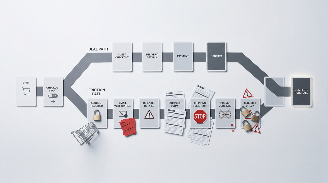
I start at "Add to Cart" and count every step. On one client's site, I counted: land on cart page, click "Proceed to Checkout," get prompted to create an account before continuing, fill in name, email, password, confirm password, receive verification email, click confirmation link, return to site, log back in, fill shipping address, select shipping method, enter credit card information, confirm order, done.
Over a dozen steps. Four of them just to create a mandatory account.
I asked the client: "Do you know what your cart abandonment rate is?"
"No idea," he said.
"The industry average is around 70%," I told him. "Yours is 92%."
The problem wasn't that people didn't want to buy. The problem was that his checkout had built so many walls that customers with real purchase intent were being turned away one by one.
How Complicated Your Checkout Is Determines How Bad Your Revenue Is
Customers who enter the checkout process are the highest-intent visitors in your entire funnel. They've seen your product, made a purchase decision, added it to their cart — psychologically, they're almost already your customer.
But "almost" and "done" are separated by your checkout flow.
Every unnecessary step, every mandatory field, every page redirect is a chance for the customer to think "you know what, never mind." Purchase decisions are most fragile at this stage. A little friction is all it takes to lose an order that was already basically yours.
Baymard Institute, which tracks e-commerce user behavior, puts the global average cart abandonment rate at around 70%. Their research consistently shows that "too long or complicated checkout" is the second most common reason for abandonment — right behind "unexpected costs at checkout" like shipping fees that only appear at the end.
The Five Checkout Friction Points That Kill Orders
Friction Point 1: Forced Account Creation
This is the number one abandonment driver. Customers want to buy something — they're not trying to start a long-term relationship with your brand. Forcing them to create an account, verify an email, and log back in is maximum friction at the moment of maximum purchase intent.
The fix is simple: offer Guest Checkout. Let people complete a purchase without creating an account. You can invite them to create one after the order is placed — at that point they've already bought, so resistance is lowest. Shopify enables guest checkout by default for a reason.
Friction Point 2: Shipping Costs That Appear at Checkout
A customer sees $49 on your product page and mentally accepts that number. When they reach checkout and suddenly see a $15 shipping fee, they don't experience it as "adding $15." They experience it as "this is not what I agreed to." That psychological mismatch is one of the biggest abandonment triggers in e-commerce.
Fix: display shipping costs on your product page, or show a free shipping threshold ("Free shipping over $75") prominently before they add to cart. Let customers know the real total before they're committed to the checkout flow.
Friction Point 3: Too Many Required Fields
Every additional required field is another reason to feel like this is too much work. Many checkout forms have twelve or more fields — company name, address line 2, address line 3, birthday — that serve you but not the customer.
Fix: cut required fields to the minimum. A standard e-commerce order needs: name, shipping address, email (for order confirmation), and payment info. Phone number can be optional. Company name, secondary address lines — optional or removed entirely.
Friction Point 4: No Trust Signals at Checkout
The checkout page is where customers enter their credit card number. It's the moment in the entire purchase journey where they need to feel most secure. If your checkout page looks generic or lacks security indicators, you can lose customers at the very last step.
Fix: display an SSL badge, accepted card logos (Visa, Mastercard, Amex), your return policy summary, and a money-back guarantee statement on the checkout page. These elements take minimal space but deliver significant reassurance at the most critical moment.
Friction Point 5: A Bad Mobile Experience
More than 60% of e-commerce traffic comes from mobile, but many checkout flows are built for desktop — buttons too small to tap, fields hard to select, content that requires horizontal scrolling. Filling out a twelve-field checkout form on a phone is genuinely painful.
Fix: walk through your own checkout on your phone right now. Are buttons large enough? Does the keyboard automatically switch to the right type — email keyboard for email fields, number pad for phone fields? Is Apple Pay or Google Pay enabled? One-tap payment can compress a ten-step mobile checkout into three steps, and it has a dramatic impact on abandonment rates.
What Happened to the Client With 92% Abandonment
I made a handful of changes: enabled guest checkout, reduced required fields from twelve to six, added trust signals and a return policy summary to the checkout page, enabled Shopify Pay for mobile users, and moved shipping cost information to the product page.
One month later, cart abandonment dropped from 92% to 81%. Still not ideal — but that 11-point improvement in checkout completion had a visible, immediate impact on revenue. And we hadn't touched the ads, the product, or the pricing.
Want to Know Where Your Checkout Is Losing Orders?
The checkout flow is the last gate in your conversion funnel — and the most commonly neglected one. Many business owners spend heavily optimizing ads and product pages, then let a poorly designed checkout block customers at the finish line.
Walk through your own checkout right now. Pretend you're a first-time visitor who doesn't know your brand. You'll find things you've gotten used to that are quietly costing you orders.
More...


Unleash Your Brand's